
Giving Experience Design
Your Fundraising Technology Is Not the Donor Experience
CRMs, donation platforms, and donor-management systems power the work behind the scenes. The public-facing experience is what creates trust, meaning, clarity, and momentum.
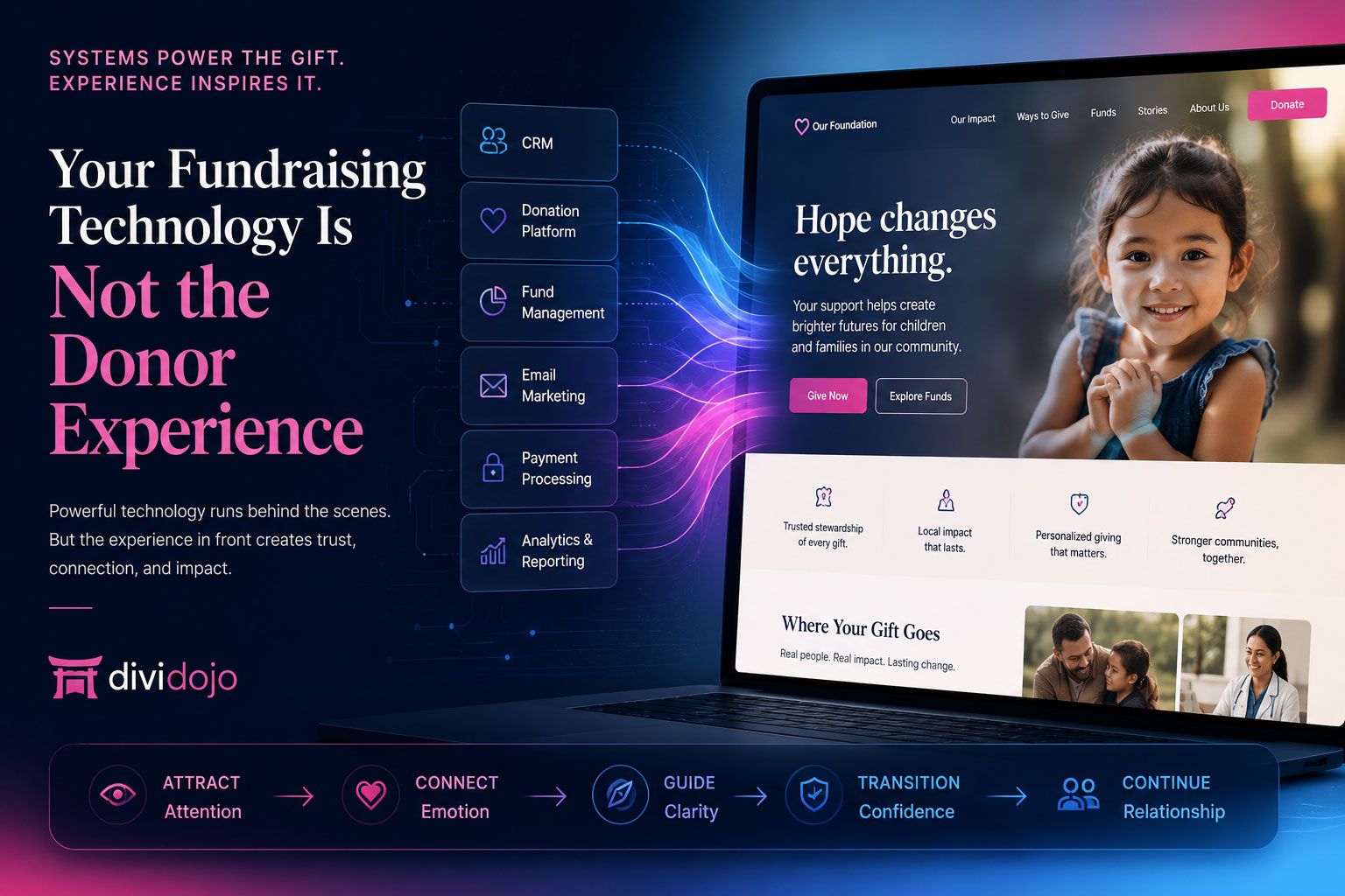
Fundraising technology is essential, but donors experience the mission through the stories, pathways, content, reassurance, and transitions built around those systems.
Fundraising technology can securely process a gift, manage donor records, organize campaigns, and connect important data across an organization.
But the donor does not experience the technology in the same way the organization does.
The donor experiences the story.
The donor experiences the website.
The donor experiences whether the mission feels clear, whether the opportunity feels meaningful, whether the next step feels natural, and whether the organization feels worthy of trust.
That distinction is becoming increasingly important for community foundations, healthcare institutions, universities, faith-based organizations, and nonprofits investing in digital fundraising.
A powerful fundraising platform can support an exceptional giving experience. But it cannot create that experience by itself.
Two different perspectives
Organizations see systems. Donors see moments.
Inside an organization, fundraising technology is often evaluated through features and functions.
Can it manage donor records? Can it process recurring gifts? Can it support donor-advised funds? Can it connect with email campaigns? Can it manage funds, acknowledgments, reporting, and constituent activity?
Those are essential questions.
But a donor rarely arrives at the website thinking about the capabilities of the underlying platform.
The donor is asking different questions:
Those questions are answered through experience design—through content, structure, storytelling, navigation, visual hierarchy, reassurance, and the way the website guides someone from initial interest toward meaningful participation.
Two connected layers
The technology layer and the experience layer serve different purposes.
- Donor-management systems and CRMs
- Donation and payment platforms
- Fund-management systems
- Email and campaign tools
- Grant and scholarship portals
- Analytics, reporting, and acknowledgments
- Stories that capture attention
- Impact that builds belief
- Pathways that reveal relevant opportunities
- Pages that explain campaigns and funds
- Transitions that prepare donors for forms
- Reassurance that helps people continue
Both layers matter. Neither should be expected to do the other’s job.
A CRM should not be expected to become the organization’s entire public story. A payment form should not be expected to explain a campaign. A donor portal should not be expected to introduce someone to the mission.
Technology becomes more effective when the experience surrounding it gives people a clear reason to use it.
The public-facing layer
The front-end experience is where generosity becomes personal.
Fundraising systems are designed to support many users, processes, and organizational requirements. That often means the public-facing screens they provide must remain relatively standardized.
A customized front-end experience has a different role. It can be shaped around the organization’s unique mission, audiences, priorities, programs, campaigns, and voice.
Different institutions need different donor pathways.
The underlying fundraising technology may support every action below. The front-end experience determines whether people can understand and emotionally connect with them.
The backend makes these actions possible. The front end makes them understandable, credible, and meaningful.
The donor journey
Five moments shape the digital donor experience.
A donor journey is not one page or one click. It is a sequence of moments surrounding the technology.
The arrival
The visitor quickly understands where they are, why the organization matters, and where they can begin.
The connection
A story, outcome, initiative, community need, or personal reason transforms institutional work into something human.
The discovery
The visitor explores giving options and recognizes the path that fits their interests, circumstances, and intent.
The transition
The donor moves into a form, portal, CRM workflow, or external system with enough context and confidence to continue.
The continuation
The confirmation and follow-up reinforce impact, explain what happens next, and make the donor feel appreciated rather than processed.
Before the form
Platform-first journeys often begin too late.
Many fundraising pathways begin at the point where the technology becomes active.
The visitor clicks a Donate button and arrives at a form. The visitor selects a fund and enters a portal. The visitor clicks Planned Giving and receives a list of technical options.
From an operational perspective, the pathway is working.
From the donor’s perspective, important steps may be missing.
The visitor may not understand the need, know which option is appropriate, recognize the external platform, or feel confident enough to make a financial decision.
A successful donor journey begins before the form. It creates the context that makes the form meaningful.
A donate button is only one moment in the larger experience.
Explore why nonprofit websites need a complete giving experience—not only a transaction pathway.
Read the Giving Experience ArticleConnected transitions
A disconnected transition can weaken an otherwise strong journey.
Many organizations use trusted third-party fundraising platforms. There is nothing inherently wrong with moving a donor into an external system.
The problem occurs when the transition feels unexpected.
The colors change. The language changes. The navigation disappears. The donor sees an unfamiliar domain. The emotional momentum created by the campaign is replaced by a generic form.
Reinforce the purpose, explain the next step, and clarify what the donor will be asked to do.
Move the donor into the trusted external system with consistent language and reassurance.
Use confirmation and follow-up to return the donor to the mission and continue the relationship.
A small amount of experience design can make separate systems feel like one connected relationship.
Different levels of intent
Better design does not mean adding more steps.
Creating a stronger giving experience does not mean placing unnecessary pages between a motivated donor and the donation form.
Some visitors are ready to give immediately. They should be able to do so.
The objective is not to slow down the direct pathway. It is to strengthen the pathways around it.
A longtime donor may need a fast giving route. A first-time visitor may need context. A professional advisor may need technical information and direct contact. A legacy donor may need privacy, reassurance, and time.
Good experience design recognizes these different levels of intent and creates direct routes for motivated donors alongside guided routes for people still building confidence.
Preserve what already works
Existing fundraising technology can become more valuable.
Organizations sometimes assume that improving the donor experience requires replacing the systems they already use.
That can make digital improvement feel expensive, disruptive, and risky.
But an organization may already have the right operational technology. What may be missing is the custom experience that presents it clearly.
This allows the organization to preserve its investment in fundraising technology while improving the experience donors have around it.
The backend remains powerful. The front end becomes personal.
Experience warning signs
Signs that the experience layer needs attention.
An organization may not need another fundraising platform. It may need a better public-facing experience if:
These are not always technology problems. They are often clarity, content, architecture, and experience-design problems.
One coherent relationship
Fundraising technology should support the story—not become the story.
The public website should not feel like a directory of systems.
Visitors should not need to understand which vendor powers each action. They should not need to know where the CRM begins, where the payment processor ends, or which platform manages a particular form.
The technology should feel present when it is needed and invisible when it is not.
The donor should experience one organization. One mission. One coherent journey.
That coherence can exist even when several systems are working behind the scenes.
Giving Experience Design
What does Giving Experience Design add?
Giving Experience Design brings strategic, editorial, visual, and technical thinking together around the donor journey.
It asks:
The result is not simply a more attractive donation page. It is a more connected digital fundraising ecosystem.
Build the experience around the technology you already trust.
The Giving Experience Studio by Divi Dojo creates donor journeys, campaign experiences, impact storytelling, advisor resources, giving pathways, and custom front-end experiences around existing platforms and systems.
Explore the Giving Experience StudioFinal perspective
Your technology may already be ready. Is the experience?
The systems behind modern fundraising are important.
They protect data, manage relationships, support teams, simplify operations, and make generosity possible at scale.
But donors do not choose organizations because of the software operating behind them.
They choose organizations because they believe in the work.
They give because something feels meaningful.
They continue because the relationship feels trustworthy.
They participate because the path feels clear.
Technology can support each of those outcomes. Experience design brings them to life.
Frequently asked questions
Fundraising technology and donor experience design.
Does better donor experience design require replacing our fundraising platform?
Not necessarily. Many organizations already have capable CRMs, donation platforms, portals, and payment systems. Giving Experience Design can improve the public-facing journey around those systems while preserving the technology investment already in place.
What is the difference between a donation platform and a giving experience?
A donation platform handles the transaction and related data. A giving experience includes the stories, impact, navigation, audience pathways, trust signals, campaign context, and transitions that help someone understand why and how to participate.
Can a custom WordPress or Divi website connect with third-party fundraising systems?
Yes. A custom front-end website can organize and introduce giving opportunities while linking, embedding, or transitioning visitors into the organization’s existing forms, portals, CRM workflows, and payment platforms.
Who benefits most from Giving Experience Design?
Community foundations, healthcare institutions, universities, faith-based organizations, foundations, and nonprofits with multiple audiences, giving pathways, campaigns, funds, portals, or complex fundraising systems can benefit significantly.
Does a guided donor journey make it harder for someone to give quickly?
It should not. Good experience design keeps a direct giving route available for motivated donors while creating clearer guided pathways for visitors who need more context, confidence, or education before acting.


Create a better experience around the technology you trust.
Turn your fundraising systems into one clear, connected donor journey.
Divi Dojo’s Giving Experience Studio designs custom front-end experiences around the CRMs, donation platforms, forms, portals, and systems your organization already uses.