Divi Dojo Insights
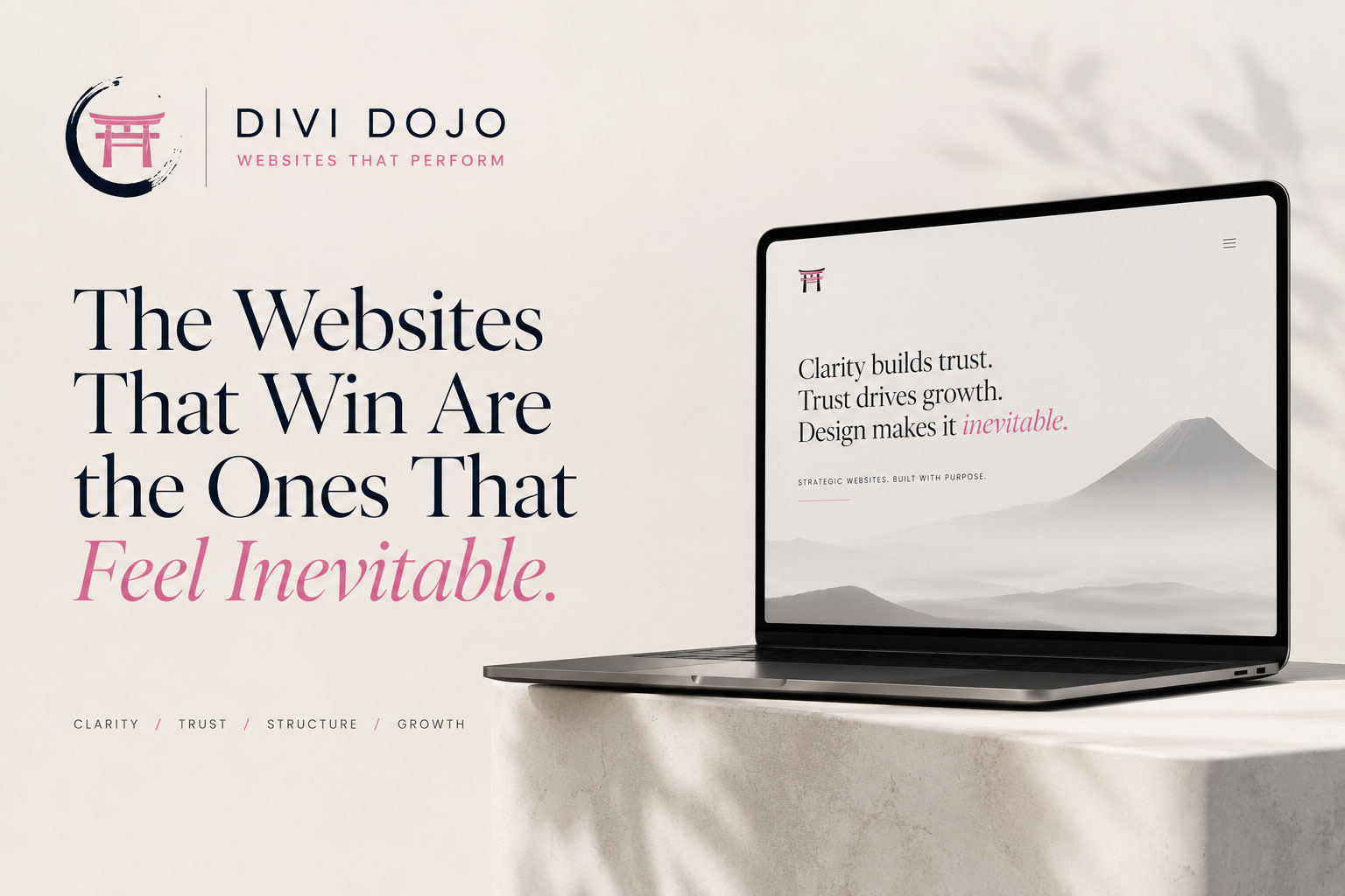
The Websites That Win Are the Ones That Feel Inevitable.
The best websites do not feel like a collection of design choices. They feel clear, confident, and obvious in hindsight — as if every word, section, and next step could not have been arranged any other way.
A great website rarely feels like it is trying to impress you.
It does something better.
It makes the business feel more certain.
Not louder. Not busier. Not more decorated. More certain.
The best websites have a quiet confidence to them. The message is clear. The path is obvious. The design feels intentional. The brand feels mature. The next step feels natural.
You do not have to decode what the company does. You do not have to hunt for proof. You do not have to wonder where to go next.
Everything feels like it belongs.
That is what makes a website feel inevitable.
Premium clarity
A good website should feel obvious in hindsight.
The word “obvious” can sound simple, but in design, obvious is hard.
It means the website has removed enough friction that the visitor no longer has to think about the structure. The order makes sense. The language makes sense. The visuals support the message instead of competing with it.
When a website is done well, the experience feels easy — not because the work was easy, but because the hard decisions have already been made.
What to say first. What to leave out. Where to place proof. How much detail to show. When to ask for action. How to make the brand feel trustworthy without over-explaining itself.
A refined website is not empty. It is edited. It removes the things that create hesitation and keeps the things that build confidence.
The visitor experience
Visitors do not want to decode your business.
Most visitors arrive with a quiet question:
“Is this for me?”
They may not say it that way, but that is what they are trying to determine. They want to know what you do, whether you understand their problem, whether you look credible, and whether taking the next step feels worth it.
If the website makes them work too hard, trust drops.
Confusing navigation, vague headlines, generic service descriptions, weak proof, inconsistent design, and scattered calls to action all create small moments of doubt.
One moment of doubt may not matter.
A page full of them does.
What creates inevitability
The best design removes doubt before it becomes friction.
A website starts to feel inevitable when the experience answers the visitor’s concerns before they become objections.
The visitor understands what you do, who you help, and why it matters without needing to piece it together.
The page knows what deserves attention first, what supports the story, and what should guide the next step.
Credibility appears naturally through work, language, structure, outcomes, and details — not through over-selling.
Restraint wins
Premium websites are quiet where average websites are loud.
Average websites often try to create confidence by adding more. More sections. More movement. More badges. More claims. More colors. More noise.
Premium websites often do the opposite.
They create confidence through restraint.
This is why premium design can look simple but feel expensive.
The confidence is in the editing.
One connected story
A website feels inevitable when everything supports the same story.
A website is not only a visual object. It is a story system.
The headline, navigation, service pages, case studies, imagery, spacing, calls to action, mobile layout, and SEO structure all communicate something.
If those pieces tell different stories, the website feels assembled.
If those pieces tell the same story, the website feels built.
That difference matters.
A strong website does not simply say that a company is credible. It behaves credibly. It does not simply say that a company is organized. It feels organized. It does not simply claim to be premium. It demonstrates premium thinking through structure, clarity, and restraint.
Templates have limits
Why template-based websites rarely feel inevitable.
A template starts with a layout.
A premium website starts with the business.
That is the difference.
Templates can be useful starting points, but they are designed for broad use. They are meant to work for many kinds of companies, which is exactly why they can struggle to feel specific to one company.
You can change the colors. You can swap the photos. You can rewrite the text. But if the structure was never shaped around your message, audience, proof, SEO goals, and conversion path, the website may still feel generic.
That is why we compare this more directly in custom Divi Website Design vs Divi templates.
The real value of custom design is not decoration. It is decision-making.
Beneath the surface
The structure below the surface is what makes the experience feel effortless.
The visitor may never notice the structure directly.
They may not think about page hierarchy, internal links, mobile pacing, content architecture, search intent, or conversion paths.
But they feel the result.
They feel when a page is easy to follow. They feel when the next step makes sense. They feel when the website has enough proof. They feel when the design is not fighting the message.
This is why we think so much about how we structure Divi websites for SEO, speed, and long-term growth.
The invisible structure creates the visible confidence.
Divi with intention
Divi can be used to build something generic or something inevitable.
The builder is not the strategy.
Divi is flexible. That flexibility can create strong websites, but it can also create scattered ones if there is no clear direction behind the build.
A strong custom Divi Website Design process uses Divi as the system, not as the substitute for strategy.
The work is in the decisions: what the page should say, what it should not say, how the content should unfold, how the design should support trust, how mobile should feel, how SEO structure should connect, and how the site should grow over time.
That is also where a professional Divi Designer can create value beyond simply building pages.
The final test
Can a visitor understand, trust, and act without friction?
That is the real test of a website.
Not whether it has the newest trend. Not whether every section is visually dramatic. Not whether it uses the most complex animation.
The real test is whether the visitor can quickly understand who you are, why it matters, whether they trust you, and what they should do next.
When the answer is yes, the website starts to feel inevitable.


Ready for a website that feels inevitable?
Let’s create a custom Divi website built around clarity, trust, structure, and growth.
If your website feels assembled, generic, outdated, or disconnected from the business you are becoming, Divi Dojo can help shape a stronger custom website experience.